- 1-2-3 Copywriting Newsletter
- Posts
- I'm Back to Handcopying 3 Ads Per Day
I'm Back to Handcopying 3 Ads Per Day
Here are my insights so far...
Kushagra Oberoi
November 30, 2025
This week, YOU, , are joining 1000+ people who’ll get this 13th edition with a new style.
I’m trying to turn this into a newsletter that’s more example-led with insights ranging from marketing and advertising to copywriting, messaging and positioning.
Let’s get going!👇🏻
I've started hand-copying (manually typing) 3 ads per day again and here are 5 insights I've gathered so far:
1. My writing feels faster and clearer. Words and phrases come instantly to me, especially when I'm trying to describe something uniquely.
2. It's a great way to discover hidden gems. I've browsed through Pinterest, random blogs, Reddit and other underrated corners of the internet in search of ads that stand out.
3. My ability to understand context has broadened. From big idea to structure—no detail, big or small, gets past me.
4. Modern ads are not audacious enough. This is what I can confidently claim after manually typing at least a dozen vintage print ads.
Majority of them started in the middle, right into the action with a story and lead that hooked you in.
It isn't always as vanilla as problem-solution. If you want to stand out, you gotta take bigger swings with your angles and execution.
5. I'm getting the hang of "thinking visually." I used to think its only for graphic designers and art directors. But thinking of a good visual can sometimes be the thing that takes your headline/copy angle from X to 10X.
P.S. If you don't handwrite or manually type ads, start immediately. It's a long-term game but a great way to be AI-proof.
1. Sainsbury’s (David Abott)
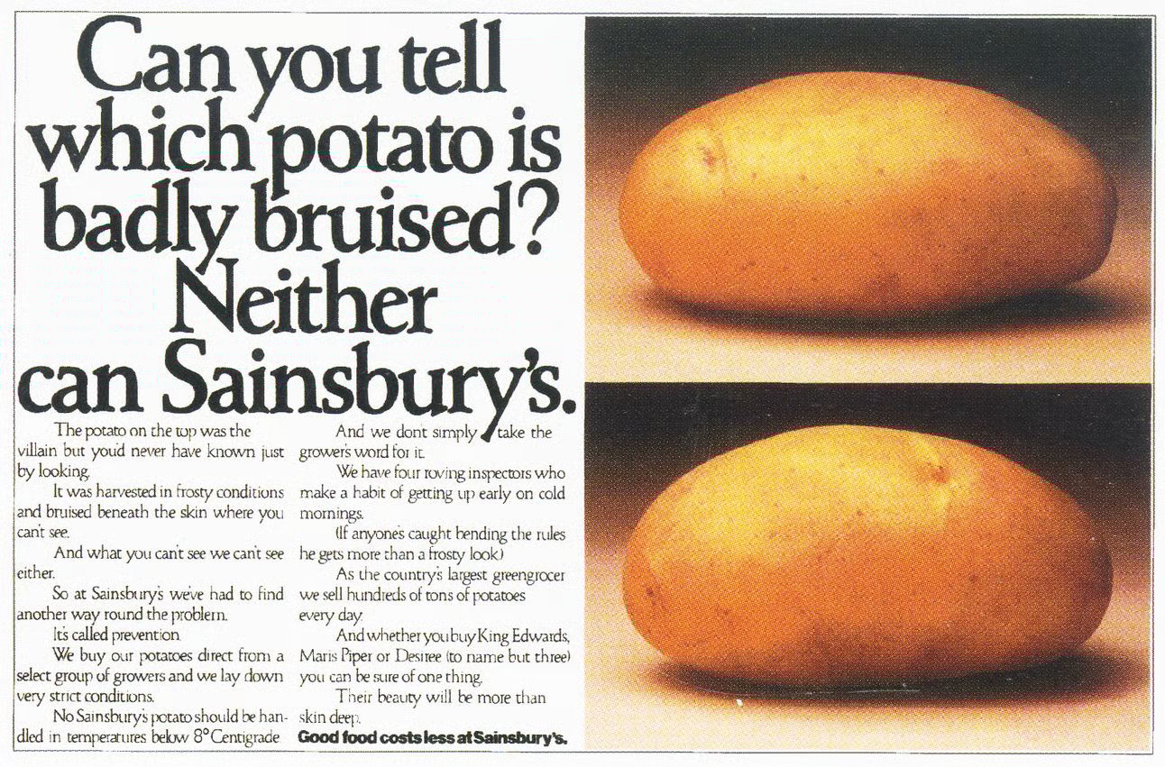
David Abott challenged himself that he won’t use the brand logo in exchange
for using the brand’s name so many times that it becomes a household name.
And it did. Sainsbury’s revival happened through this campaign.
But the beauty of the ad is how it tells a story about the strict standards of Sainsbury’s instead of focusing on discounts, offers or deals.
2. Mercedez Benz
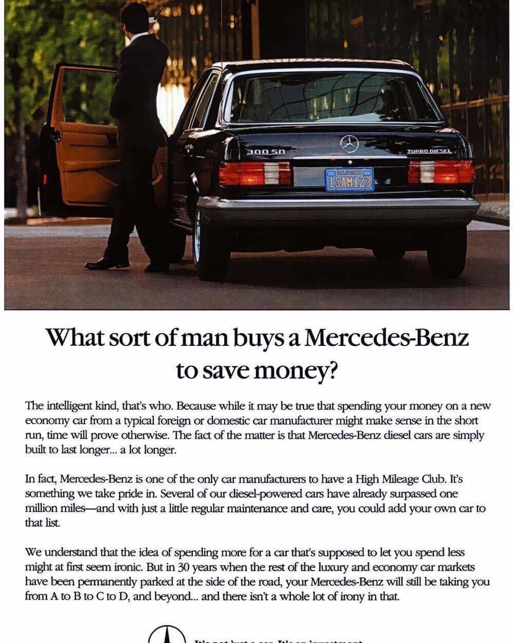
The headline got me. Because it has contrast.
Plus, the whole ad tells the story of how you're not actually buying a Mercedez but investing in one...
Considering MB cars are built to last longer.
And that’s shown with proof.
3. Barska Optics
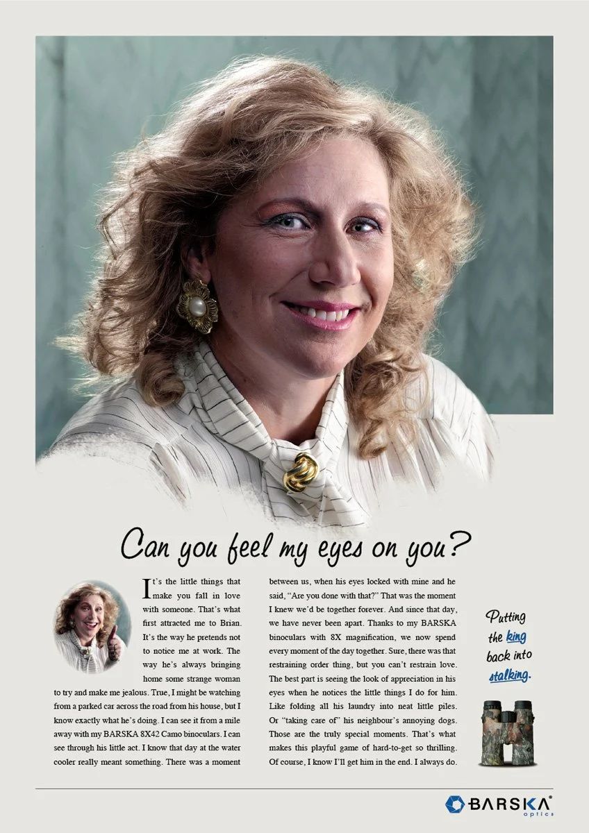
This ad for Binoculars actually tells a story about being delusional in love to the point that even stalking them (for real) is acceptable.
And Barska binocs is the device she uses to do it.
Notice how little is said about the actual binocular features and how much of it is just a sarcastic story told wonderfully well.
It’s true: People don’t read an ad. They read what interests them and sometimes, it’s an ad. This is THAT ad.
If you’re reading on a desktop, laptop or a tablet—great. But if you’re on mobile, I urge you to take a couple of minutes and read the actual ad. Not just my insights.
Because that’ll help you create your own insights, your own perspective and see what a good ad actually means.
Take it one step further: Line after line, note exactly what impressed you the most. Was it the choice of words? The big idea? The emotional triggers? Something else?
Just note it down and refer to it later when you’re creating an ad for your next client.
That’s it for today!
What do you think about vintage ads and today’s newsletter?
Hit reply & let me know your thoughts, !
P.S. Don’t forget to tell me your favourite thing about this newsletter. I’m collecting responses to build the next thing in this space.
Cheers!
Whenever you're ready, here's how I can help you more (FREE):
1. ZERO to ONE Copywriting Resources (Notion download!)
2. Check out my Twitter for more content.
3. LinkedIn is my OG platform, so do connect if you haven't already!
4. Missed previous editions of the newsletter? Read all of them here.
5. Want me to write copy for your business? Click here to learn more.
Reply