- 1-2-3 Copywriting Newsletter
- Posts
- How to Create Minimal Ads with a Simple Principle
How to Create Minimal Ads with a Simple Principle
It's crazy how simple it is...
Kushagra Oberoi
June 29, 2025
This week, YOU, , are joining 1000+ people who’ll get this 128th edition in their inbox today.
It’s called the 1-2-3 copywriting newsletter, where every week you’ll get:
1 Copywriting Tip
2 Examples
3 Tactics on how to use it for your business.
Best part? You’ll get all the good stuff by investing less than 5 minutes weekly.
Have you ever seen such a win-win situation? Me neither.
Let's go! 💪🏻
1 Copywriting Tip
Tip: Create Visual Dissonance
The best ads are pattern breakers. They are literally meant to stop the scroll.
And one of the best ways to do that is surprise and delight. By creating psychological discomfort, often visually.
Let me explain...
Take a product and put it in a setting you've never seen before.
This could be visually, or directed via a headline or a hook.
Remember Apple's most famous billboard of all time? It had a picture of the first iPod and the line...
"1000 songs in your pocket"
That's prime VISUAL DISSONANCE at play.
It might take a second for you to get it but once you do, you'll never forget it.
The brain cannot comprehend how 1000 songs (which seems like a lot) can fit into this device.
But when you get it, you get it.
You cannot see the 1000 songs neither can you see the pocket, but what you can see is the device And that's what brings everything together.
That's how visual dissonance:
Creates a pattern interrupt
Highlights a benefit/USP
Builds curiosity
With the primary principle being juxtaposition.
Get it now?
Let me share two great examples to give you an even better idea...
2 Examples
1. IKEA
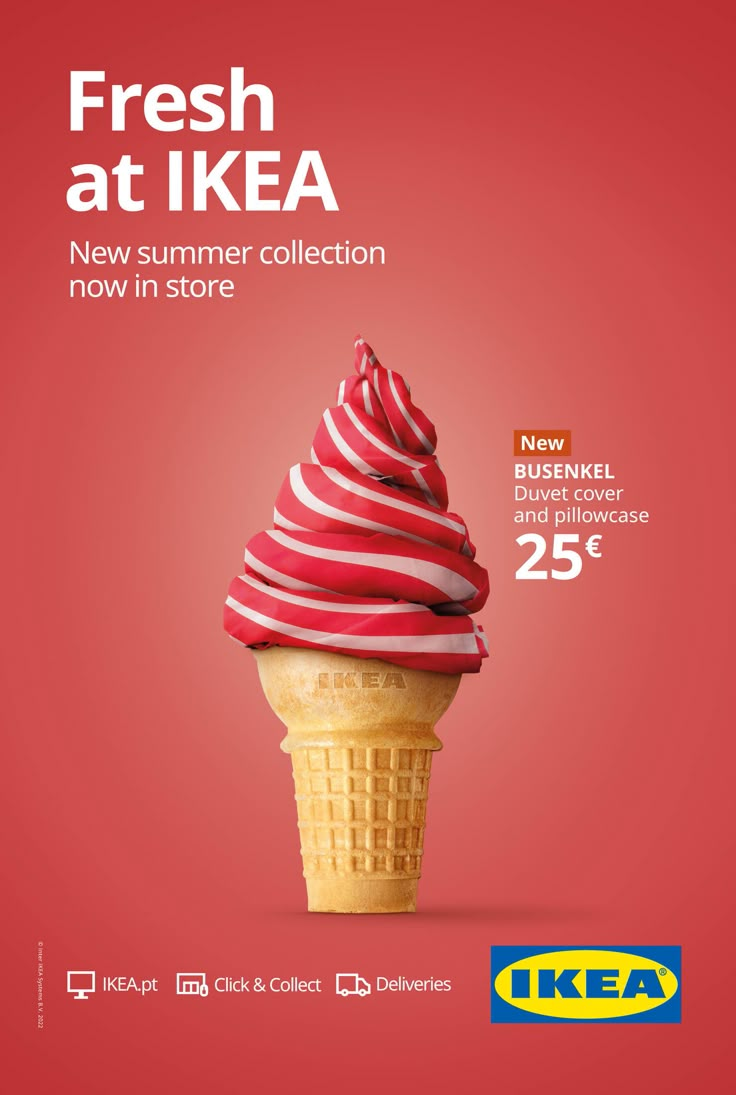
Ice Cream. Summer. Visual metaphor set.
The duvet cover that acts as the swirl on top is where dissonance comes in.
Takes a second to get i. But the moment you do, it delights.
2. Amazon Kindle (Spec Ad)
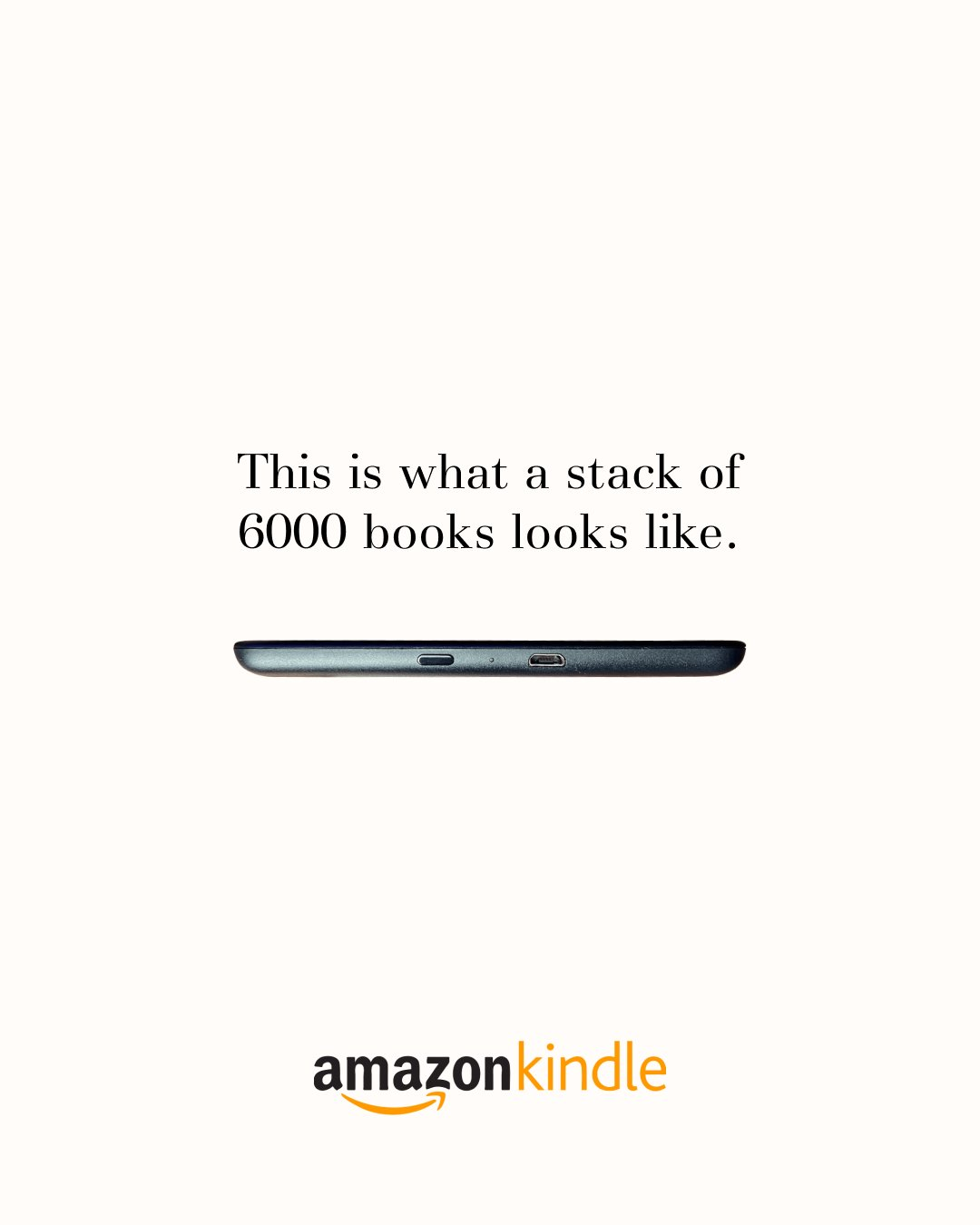
This was created by @The_AdProfessor on Twitter.
It follows the Apple headline principle with dissonance on display. As clear as day.
You neither see 6000 books nor a bookshelf. But you see the bridge that will make it happen...
And that's the shining USP of the product on display.
3 Tactics for You
1. Emotional/Visual Conflict
Pair a visual that evokes one strong emotion with an element that suggests its complete opposite, creating a memorable emotional tension.
Example: A flower growing in a war-torn landscape symbolising hope.
2. Suggest a Replacement
In the case of Kindle, it's like a portable bookshelf that replaces your stack of books.
Ask yourself: What can my product replace by making life easier for people?
And build from there.
3. Focus on a Staple Item
Summer screams ice cream. That's why IKEA led with that, even for advertising their duvet covers.
Find a popular symbol that's related to your brand, product, season or niche and lead with it.
Well, that’s all I have for you today 🤝
What do you think about creating visual dissonance and today’s newsletter?
Hit reply & let me know your thoughts, !
P.S. Don’t forget to tell me your favourite thing about this newsletter. I’m collecting responses to build the next thing in this space.
Cheers :)
Whenever you're ready, here's how I can help you more (FREE):
1. ZERO to ONE Copywriting Resources (Notion download!)
2. Check out my Twitter for more content.
3. LinkedIn is my OG platform, so do connect if you haven't already!
4. Missed previous editions of the newsletter? Read all of them here.
5. Want me to write copy for your business? Click here to learn more.
Reply